It is that time of the week again. It is time to look at my favorite newspaper front page of the week.
As always, I culled through the front pages shown at Newseum.org and picked my favorite.
So here it is:
The Lompoc Record

Usually in this feature I talk about a front page or set of front pages I really liked. Today is different.
This front page, from Wednesday’s Lompoc Record of Lompoc, Calif., is bad.
The page is utterly boring. It is devoid of anything interesting for the eye to enjoy. The only piece of art in the entire layout is a large photo that isn’t very engaging. It is of two people watching a third person do something, and you can’t even tell what is being done.
Sure, the story that goes with the photo might be interesting, but the layout gives me no reason to read it.

And the rest of front page is text. Just text!
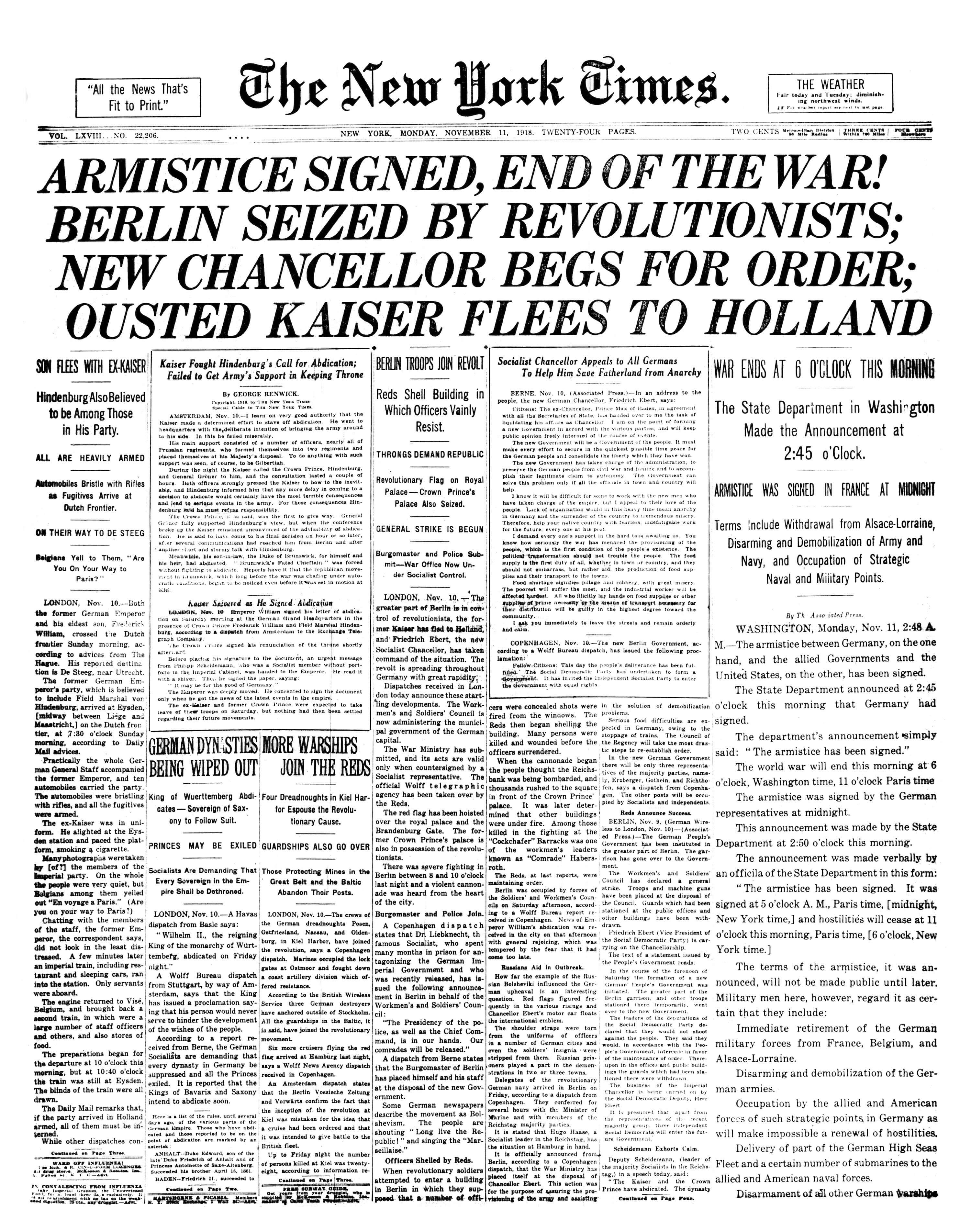
Who does this? It looks like a front page from the early 1900’s.
The designers at The Record need to get a clue and produce something engaging.
At the very least, if they were only going to use one piece of art in the entire layout, they could have used a better photo.
In the future, I hope The Record does a better job because it isn’t good when a front page jumps out of the Newseum display because it is so gray in a sea of colorful and image heavy layouts.
